Classroom set-up: Less is more… OR it's not about you… OR authentic use of space
Beginning of the 2021-22 School year the room looked like this. Simply decorated and ready for student work and input.
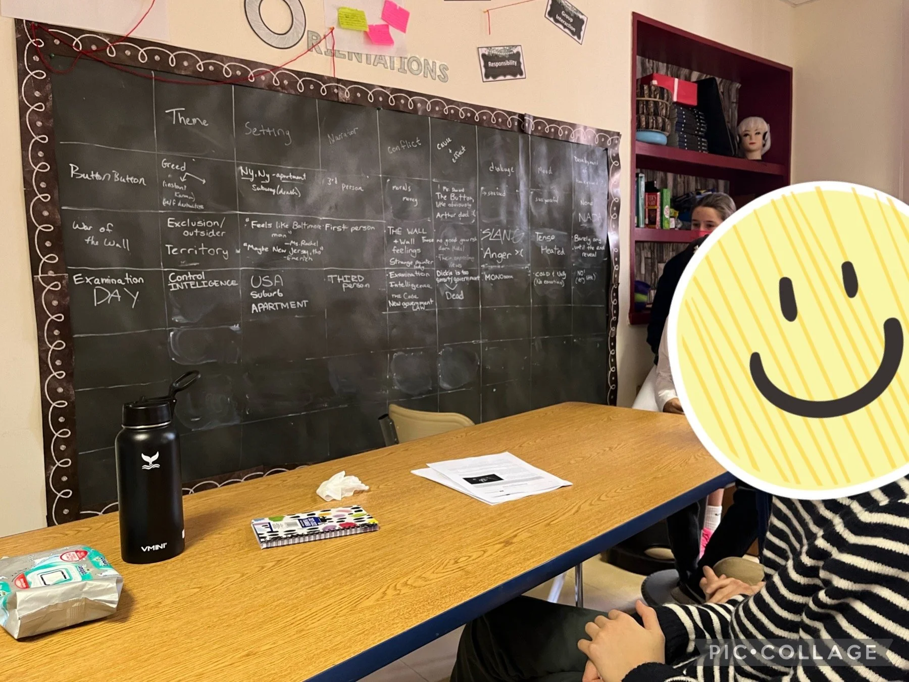
I have decided each year to use contact paper or peel and stick blank wallpaper as a piece that students can write directly onto.
So- I just got the email for the report back date and figured, welp, it's time to start sharing on how to do set up for an inquiry and concept-based classroom. I wrote about blank walls last year https://conceptbasedteacher.me/blog/setting-up-your-room-for-inquiry, but thought it was worth a reminder- why less is more- especially at the beginning of the year. Resist the temptation to Pinterest up the classroom and keep up with those beauty all over the 'gram. It is worth it to allow your class to make the room "yours" as a community. Trust me on this- AND I like reminding the kids how it's changed over time too by randomly showing where we've come from.
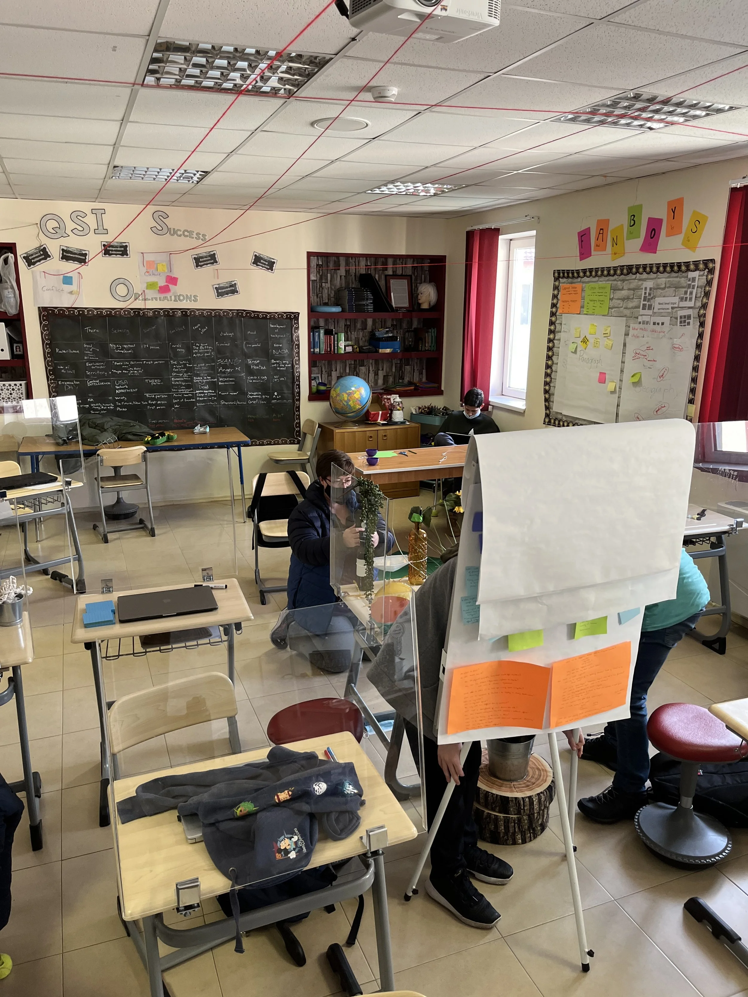
Additionally, I like having the room as a place to see what they have learned and allow for them to reflect. Here's an idea of how that looked this year:
As you can see it was fairly empty, but quickly became very colorful. It has personality and belongs to the students. It's their ideas, their research, and their connections.
We even go a little extra funky sometimes and added visual connections that stayed up all year. If we were able to add more between larger concepts, then new post-its or new string would be added.
I hope this helps you to resist the urge to overdo your room and allow it to start off a little bit empty and come together as a shared space and centers student work and voice. If you are wondering where my backing, contact paper, and chalk pens are from you can find it here (using these affiliate links supports me):
I've reused both the blackboard and white board backing for four years already and they are still going strong. So it’s good for the environment and awesome because you can draw and erase on both so can be updated all the time. You'll notice I update my graphic organizers with the chalkboard markers all the time.
Using our chalkboard graphic organizer for yet another unit.
And the organized chaos ensues…but everything on the walls is now student-made and created:)


